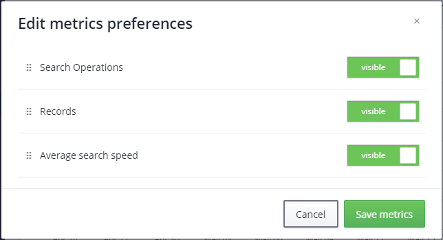
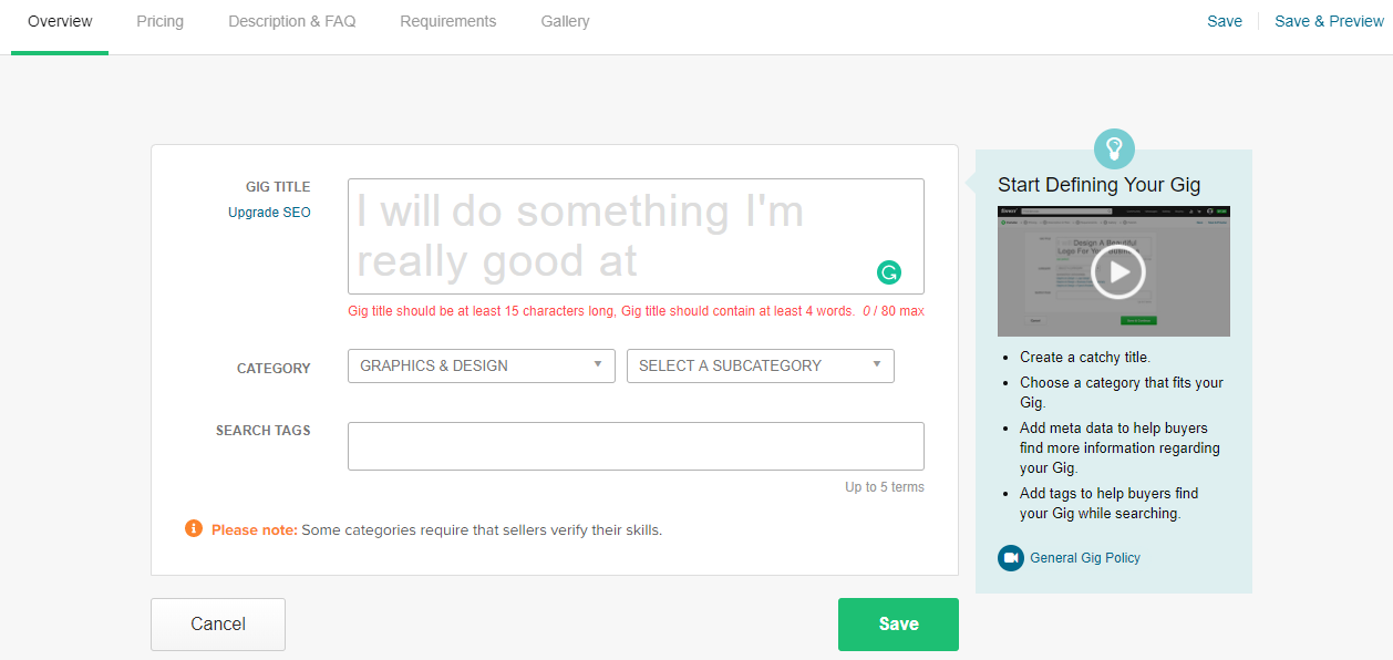
Let’s try to define some general rules for buttons — the most common interaction medium of actionable pages and dialogs. We will try to figure out where to better place them, and what order they should be in to minimize possible issues when you add more screens.
This topic arises regularly on UX-related threads, and frequently ends with simple conclusions like “follow system guidelines”, “I like when OK is on the right” or “I like when OK is on the left”. This is too simplistic, and doesn’t show you all the issues you can face when you add the second set of dialogs and pages that require some specific actions. You may eventually realize that you are placing buttons in different ways on different screens.
First of all, a couple of words about consistency. Consistency should always be the key concept when building your application. Once you pick some UX principle, follow it in all parts of your application. We will analyze this later in detail; for now, we will just take a look at a couple of inconsistency examples that exist in well-known products.

And many others. But let’s start with button positioning: what are some typical places to put buttons on the screen?
Traditionally, both of the most popular desktop platforms, Windows and MacOS, follow the same principle for their button placement on dialog windows — the bottom right:
Typically, the dialog window has size constraints, and often most of the area is filled with content, so right-side placement works rather well:
Possibly, the decision to place buttons on the bottom right of the screen was made due to the assumption that typical user attention flow (and often mouse movements) follows a Z-shaped pattern (Gutenberg diagram), which describes western culture user’s reading patterns, from the top left of the page to the bottom right:
But let’s take a look at other examples. Obviously, it applies very well to content-heavy pages, where content is uniformly distributed across the page, and the user discovers every section:
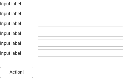
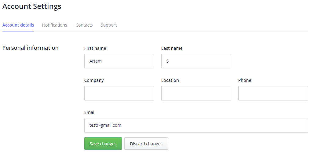
But if we consider all types of pages and dialogs, especially web apps, we will see that the typical layout differs from the previously shown dialog. Everyday dialogs are often much closer to a single column of options with buttons at the end:
Is top to bottom right the natural flow for such cases?
Maybe this would work better (faster)?
And instead of this,
maybe it would be better to have this:
Actually, in many cases the shortest path would be if, instead of aligning buttons on the right,
we aligned them on the left:
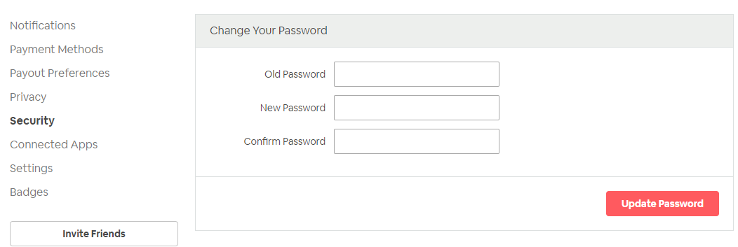
Left-side button placement is especially good when you have input/control titles at the top:
In this case, user attention flow is direct:
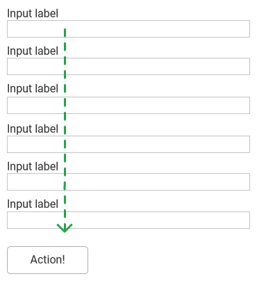
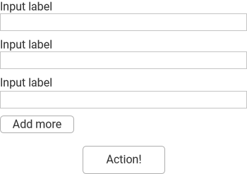
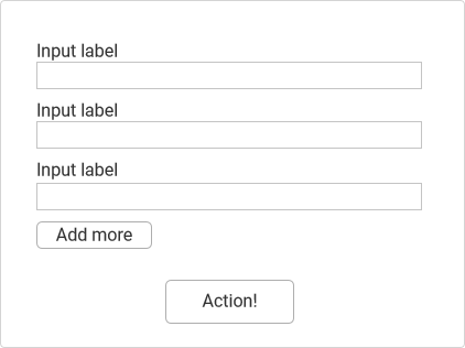
It is possible to left-align a button according to inputs/controls, especially if all of your forms have inputs and titles on the left, like this:
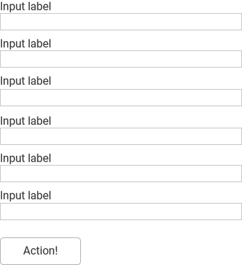
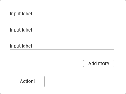
This layout works especially well when the button is related to a single input,
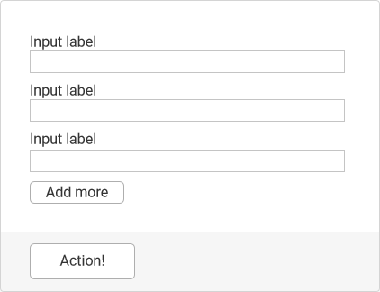
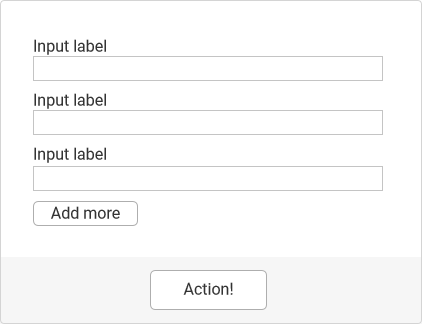
where the user won’t be confused if this button relates to the whole form, or only the last field. In more complex cases, the main button (“Action!”) may collide with inline buttons (“Add more”)
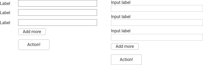
To eliminate this, add a background to the main buttons
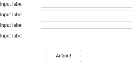
or right-align supplementary buttons:
Anyway, the left alignment is not very frequent in dialogs, so in most cases, it is better to use central alignment, which is good for dialogs as well as being easily applicable to different layouts, and generally provides good visual stability to a form:
The tremendous growth of web-applications popularized pages with an application layout that was not usual for regular desktop applications, with their classic “main window plus many dialogs” concept. And now, pages are frequently used not just on informational and e-commerce websites, but on web apps as well, and action buttons are a natural part of these pages:
And you may have noticed, the previously mentioned Z-shaped pattern is not yet applicable to these pages, as page content is not fully distributed across the page width, such as what we saw for dialogs. An F-shaped pattern is much closer to these pages:
Additionally, see this research about attention flow on pages with a form.
Placing buttons in the bottom right corner to follow a Z-shared pattern would look absurd, and cause some difficulty, as it would break the user flow on this type of page.

The left-aligning buttons here look absolutely natural. Moreover, even a center alignment would cause some trouble on wide screens, because of the long movement path from input and controls to buttons.
However, if it is a simple page with uniformly distributed content, centering buttons is generally the best way to place them:

For dialogs and pages with inputs and controls, use left or center button alignment. If you have simple informative pages, centered buttons will work the best.
Now that we’ve defined where to place buttons on pages and dialogs, we can easily determine a general rule for button ordering. This rule just needs to follow normal human logic and be quick and easy to use. Do you agree?
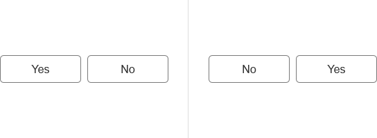
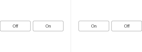
What order looks natural? How would you place Off and On buttons if you needed to?
Let’s check how it is implemented in machine control panels.
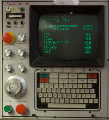


The first action is positive, the second is negative. This is the natural order of things. You start something as the first action, and finish as the second:

This button order works very well for the previously discussed centered/left-aligned layout for both dialogs and pages:
You left-align or center buttons when you need to, and everything works fine.
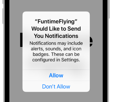
We needed to ask these “yes/no” questions because of a simple reason — the growth in popularity of the opposite approach, which is highly influenced by Apple. So, we need to take a closer look at it.
MacOS button placement is described in Apple’s Human Interface Guidelines:
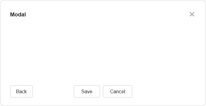
Any buttons in the bottom right of a dialog should dismiss the dialog. An action button, which initiates the dialog’s primary action, should be farthest to the right. A Cancel button should be to the immediate left of the action button. If a third dismissal button exists, it should be to the left of the Cancel button
MacOS, iOS, recent versions of Android — all of them follow this rule. So you see, this “primary right” concept has become very popular. Many people like this placement, and consider it as a good method to place buttons, mentioning these reasons:
- 1. You read from left to right in western culture, so when you see something like

you read it as “Delete. Cancel. Save”. Your main supposed action is Save, so you don’t need to come back, in contrast, to reverse order

where you read “Save. Cancel. Delete” and then go back to Save.
Actually, this is seen as the most questionable point among other developers.
There is a nudge theory in behavioral psychology. In a couple of words, “Putting fruit at eye level counts as a nudge. <…> Greater number of consumers chose the renewable energy option for electricity when it was offered as the default option.”
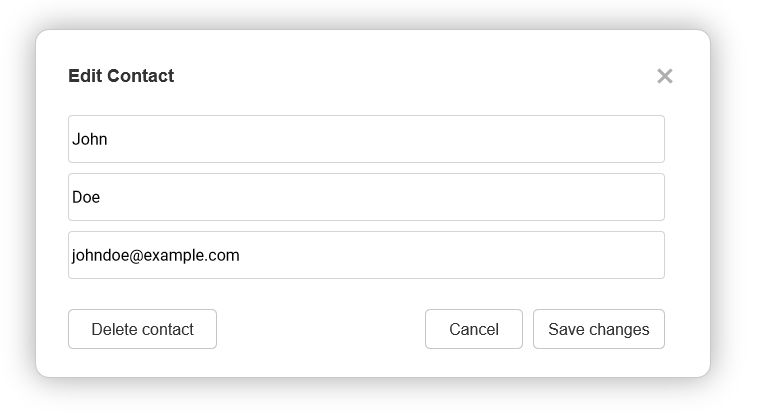
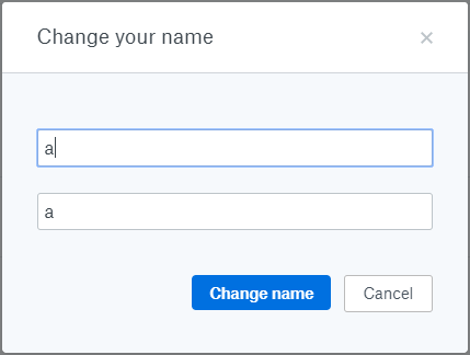
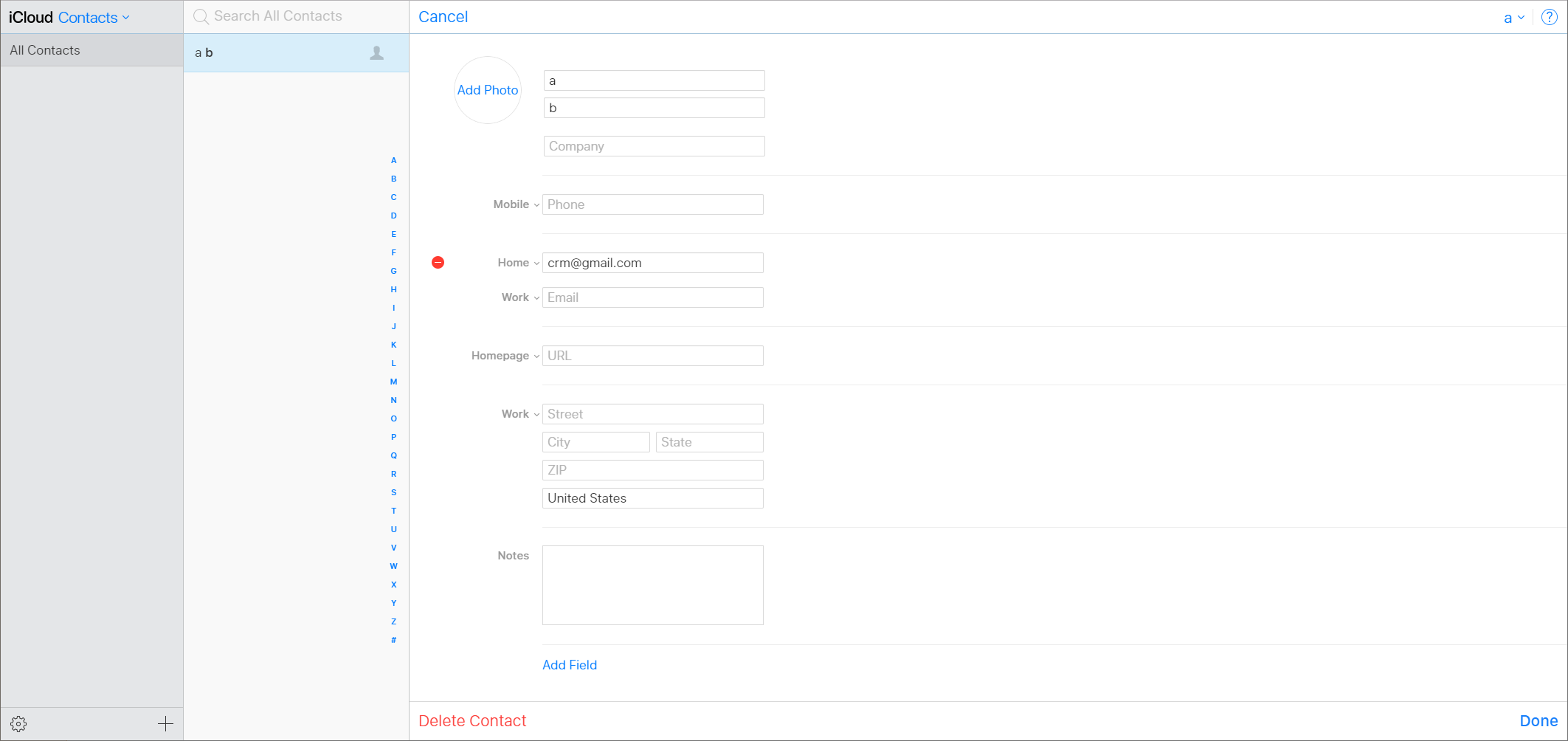
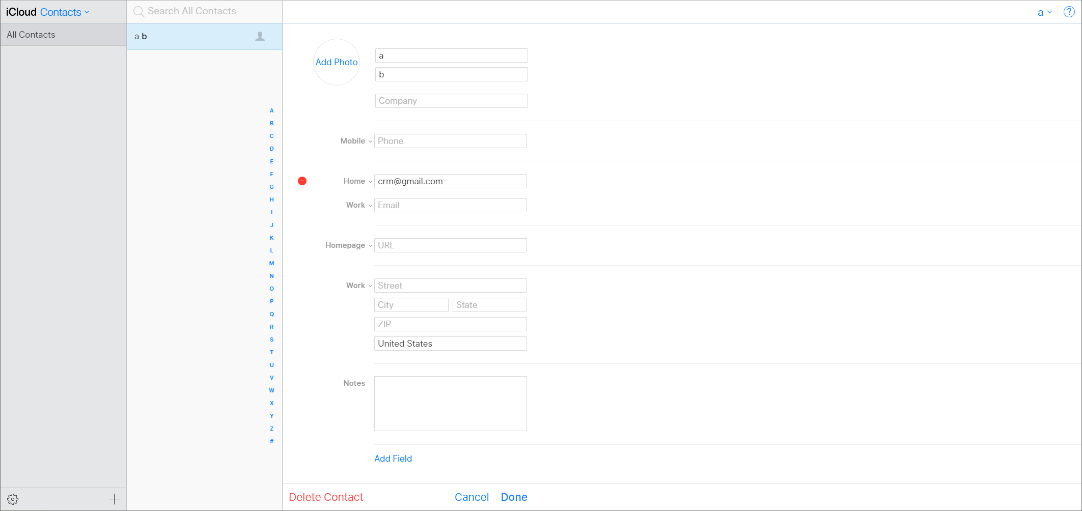
Let’s say we are editing a contact in an address book, and the UI offers 3 options for us: cancel the process, save changes, delete the contact. What is the most probable (primary) action for a contact editing page? Obviously, saving changes. Later, we may want to go back (cancel) or perform a destructive action (deletion).
How it would look in the “primary right” concept?
In “The Media Equation” it states that «people not only can but do treat computers, televisions, and new media as real people and places. Studies demonstrate that people are “polite” to computers».

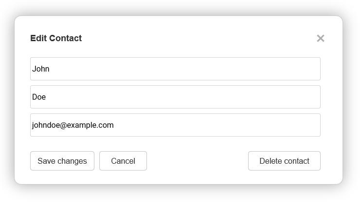
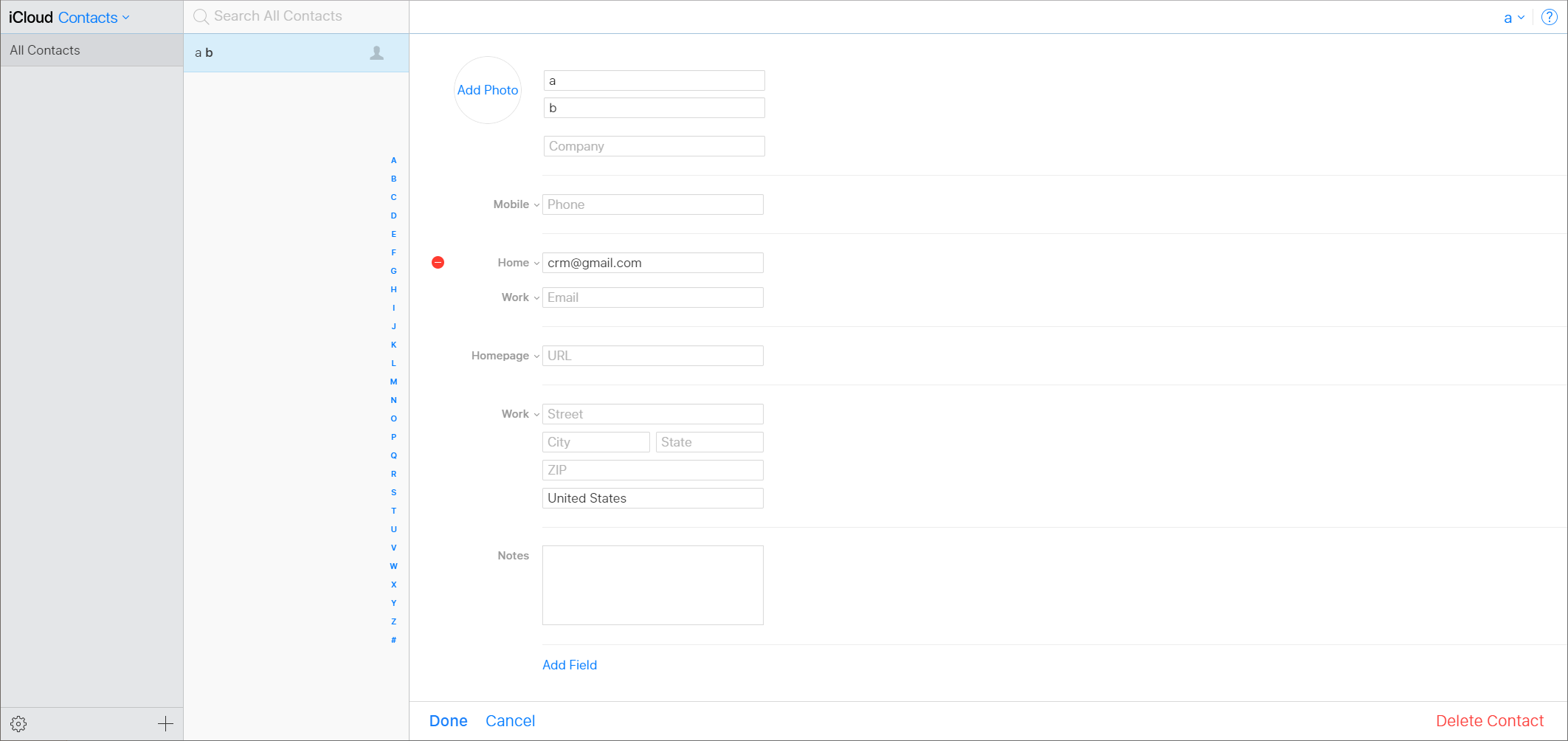
How about the classic order?

How would you react if you wanted to purchase a book in a book store, and the sales manager started the conversation in this way:
“I would like to offer a couple of options to you. First of all, you may select a different but similar book; there are plenty of others. Second, if you need help, reach me at that corner of the shop. And third — we have a 30% discount on this book today!”
Possibly, the “read all options first” rule works just for first time usage, and once you get used to the available choices, you just quickly hit “Save”, without reading all of the titles every time?
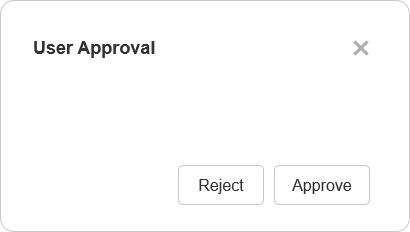
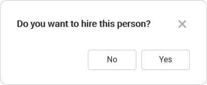
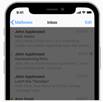
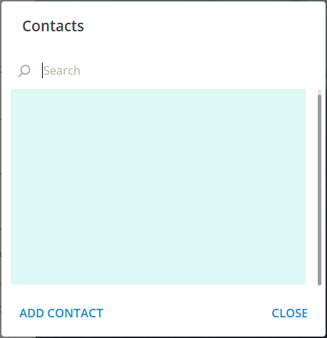
Another example. You have some staff management software, where you approve or reject users for some work. “Primary right”:
This is a dialog. Let’s say we additionally have a table with users:
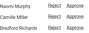
We offer to reject the user as a first action. Definitely, this is not a primary action that a staff management system should promote. This is correct:
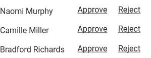
and it collides with a previously shown popup. In other words the “primary right” rule asks:
Apple says you should use metaphors while breaking them at the same time. People think based on highest priority to lowest, and from positive to negative, not in the reverse order.
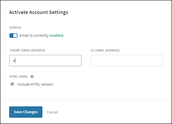
2. When a button group has the “primary right” button, the main actionable button is always in the same place — the right bottom edge of the screen:
Actually, if you left-align buttons using the “primary left” rule, the main button will be in the same position as well (but in the left corner instead of the right):
3. When a window has steps, placing the “Go back” button on the left looks natural:
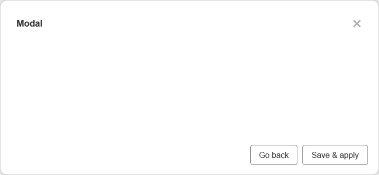
Placing this button using the “primary left” order, you will have options like:
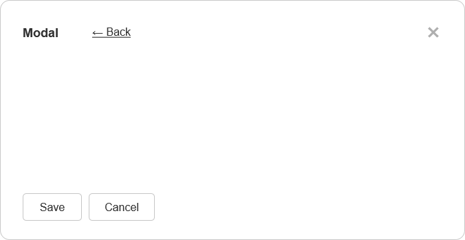
or
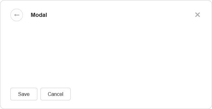
The second option is the most common case now for all mobile interfaces:
Actually, Android has the best solution for such a common case of user behavior: “All Android devices provide a Back button <…>, so you should not add a Back button to your app’s UI”.
When using the center button alignment, you will additionally have a place for a back button on bottom, if you need it:
As mentioned at the beginning, consistency should be a key principle in your UI’s behavior. And the “primary right” rule creates lots of trouble with consistency, as the way it seems “acceptable” in dialogs becomes “strange” on pages or lists, so the order is changed to “primary left”.
At the beginning, we saw examples of different button orders in Google and Adobe products. Let’s look at other samples.
Axure (prototyping tool):
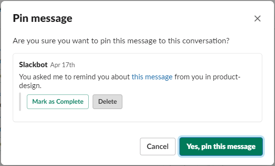
Slack (different order within a single dialog):
Github:
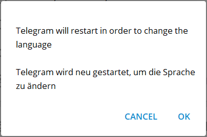
Telegram:
Dropbox:
Gmail:
Fiverr:
Algolia:
Definitely, if you develop a MacOS application, it’s better to follow Apple’s guidelines, as there is no point in breaking system-wide rules. But what to do when you develop a web app that targets a general audience?
Use “primary left” button placement. In the “primary right” case, you may have so much inconsistency that you should carefully consider the “primary left” order one more time. Here are some typical issues.
“Primary right” examples:
See? Right after you fill out the form, you are offered the chance to delete your account:
Is this the main action on the contact editing page? We can place Done and Cancel buttons closer, but the question remains:
Just for comparison, classic ordering:
In other applications, designers may consider this button ordering on pages as too strange, so, despite following the “primary right” principle and right-alignment for dialogs, they use left-alignment for pages, which leads to inconsistency.
Airbnb:

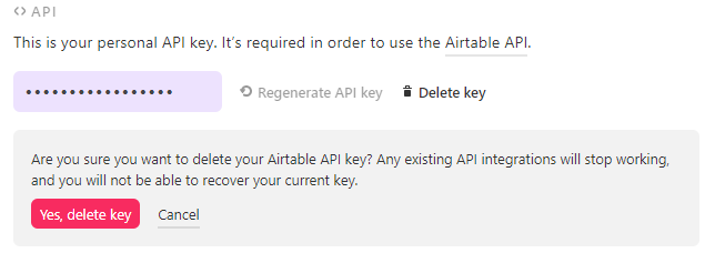
Airtable:
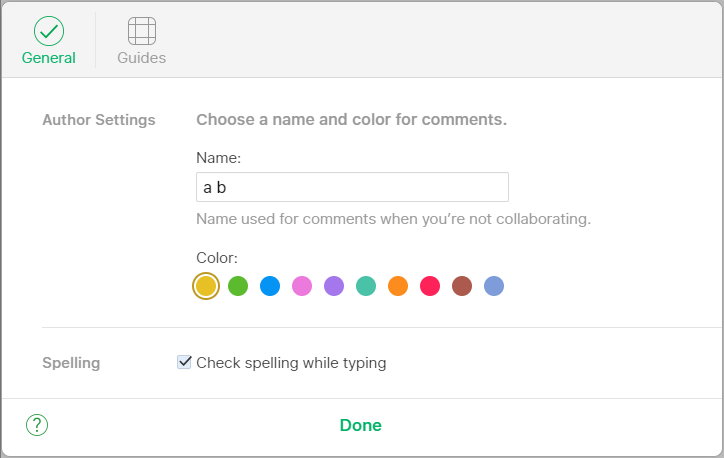
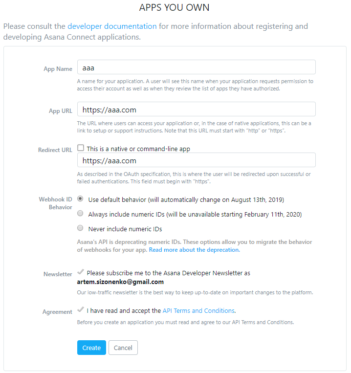
Asana:
Github:
A typical example of inline action is when you want to offer in-place editing of fields:

Here is a sample from Github:

To be consistent, they have to place buttons as:

So, you edit a name, and the application would ask you: “Cancel?”. It’s far too ridiculous, so they used the “primary left” order.
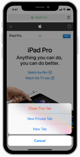
Here is a sample from Apple, text replacement:

As you see, it is the same as

and it follows “primary left” order. Interestingly, for formula editing, they are consistent:
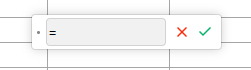
The user reads this as “write formula, and we suppose that right after you do, you will want to delete it.”
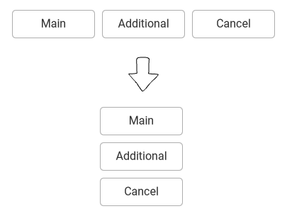
Everything is clear when we use the “primary left” rule — it simply becomes “primary top”:
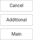
In “primary right,” it should work in the opposite way:
But Apple uses another order, where the primary button is on top:
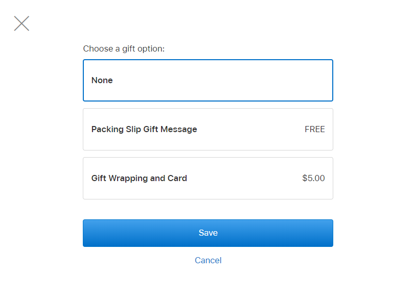
It is hard to say why, in such narrow case, it is recommended to put the main action topmost (most important first), and in wide — the main action is foremost right (most important last):